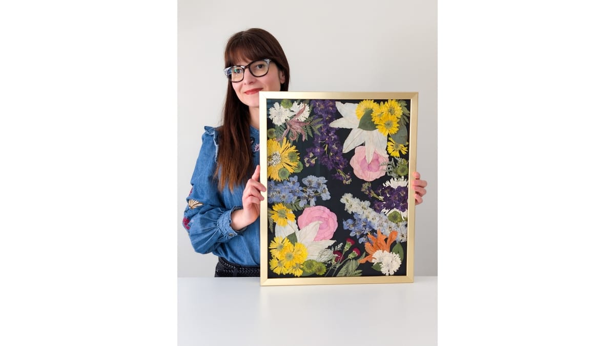
There are two moments I look forward to most in the studio.
Opening a press.
And sitting down to color correct with alcohol markers.

Left: Flowers from my garden that faded in storage over a few years.
Right: The same flowers I corrected with alcohol markers
Now, you may prefer the natural look of faded flowers (I do too in most of my personal work).
But across the 1,200+ pressed flower frames and resin pieces I've created as a pro artist, the overwhelming majority of my clients opted for color correction.
I'm not looking to settle the debate over natural vs. corrected. I just speak from my experience working with paying clients. Most want their flowers color corrected, so I have had to perfect my skills.
And if you’re correction-curious or pressing for fun, bringing color back to your favorite pressings can be an incredibly rewarding and relaxing experience.
Why no single method works for every flower
If such a unicorn exists, please send it my way! Joking aside, there are three practical reasons why:
Flower color: White flowers need an opaque type of color correction, typically in the form of paint (acrylics or sprays) or compacted powder (soft pastels). Ink-based color correction (like markers) won’t work on white flowers.
Flower texture: Wet color media, such as water-based paints, are too heavy for thin, translucent petals. They immediately reabsorb the water and curl up or wrinkle.
Flower shape: 3D flowers dried in silica are too fragile for even the softest brush bristles and for heavy paints.
Once you understand these factors, color correction becomes much easier to master.
I have experimented with all methods and then some. And I have my favorites and foes.
Let's take a look at each.
1. Pan pastels
Very popular among hobby and pro pressers alike. The compacted powdery color is easy to apply with the right applicator (I prefer silicone makeup sponges).
The color range is incredible, and they are blendable.
They have a few downsides that keep me from using them more broadly:
You do need to wear a mask or respirator because the dust will affect your lungs.
The dust will rub off and transfer, though you can reduce the risk by spraying a fixative after you finish.
They produce a heavy, chalky look, especially when applied with a heavier hand (practice and technique will help with more natural results).
Building a good range of colors can be expensive.
I use them in about 20% of my studio work, mostly on white and pastel flowers.
2. Alcohol markers
They solve the most common color problem: a flat, pressed flower that has faded but still retains some of its original color.
The results look more natural than anything else I have tried because the color is translucent rather than opaque.
They are quite affordable and don't require any special precautions, other than ventilation if you're sensitive to alcohol vapor.
Once dry, the color won't rub off or run.
A few downsides:
They don't work on white flowers because white markers are translucent and meant for blending.
Although they can diminish the look of browning, especially on darker flowers, they won't hide it.
I use them in about 45% of my studio work.
3. Acrylic paint and markers
My first serious attempt at correction back in 2022, and the one I gave up on.
The color range is excellent, especially in the white range, and it is opaque enough to cover browning.
They are also more affordable than pan pastels.
The drawbacks:
Acrylic paint tends to go on thick and pasty (non-water-based thinners may help, but not always).
The water content adds moisture back in the petals, which makes them curl and wrinkle.
The finish may look obviously painted.
I do not use acrylic by brush on flat pressings at all.
4. Floral color sprays
This is my second-most-used method in commission work.
Spray application is relatively controllable and buildable. I use them for white flowers in particular and to hide stubborn browning.
They work for 3D flowers, but the application won't be as fine, thorough and even as the airbrush method.
At $15 or so per can, this is the most expensive method of all, but in my studio work it is a worthwhile cost.
Some drawbacks:
Mastering the application takes practice. Get too close and the petals will curl up from the heavy residue.
The fumes are toxic, so you need excellent ventilation and a mask, every time.
You will need to build a semi-enclosed workspace (e.g., a large box) to prevent overspraying.
The color may run into resin, so sealing after correction is a must.
I use them in about 35% of my studio work.
5. Airbrushing
For 3D flowers dried in silica, this is the only real option.
A dimensional flower needs a gentle liquid application that reaches every nook and cranny.
The airbrush delivers the color as a mist, so almost nothing touches the flower.
You can use both acrylic paint and alcohol ink with an airbrush machine.
Some drawbacks:
The machines are loud and the applicators clog.
When used with acrylic paints, cleaning the applicators is time-consuming and somewhat tedious.
Just like with sprays, you will need to build a semi-enclosed workspace (e.g., a large box) with ventilation and wear a mask.
I do little 3D work these days, so I don't use this method anymore.
So which color-correcting method should you start with?
If your flowers are pressed flat and still hold some of their original color, start with alcohol markers. Low cost, no special set-up or protective gear, and relatively fast to apply.
And because alcohol markers are translucent, you can use them on freshly pressed flowers if you want to delay fading from the start. Just make sure you shade-match so the application is seamless.
Want to learn the alcohol marker method?
You’re in luck! I just launched a mini-course that covers everything I know about it.
Shade matching, application technique, color chart… all in a 30+ page PDF guide and 40+ minutes of video.
And I’m so confident that you’ll love this course that I offer a 30-day refund.
If your flowers are white or have browned, experiment with both pan pastels and sprays. Pan pastels tend to be easier to apply and somewhat more affordable. Start with the one color that gives you the most trouble before you buy a full range.
Which color problem are you dealing with most: color that faded, whites that yellowed, or stubborn browning? Tell me in the comments!